We thought it would be interesting for our CRO team to compare the quality of landing pages for the top four results of popular commercial search terms on Google. In order to evaluate these pages we’ll use our landing page scorecard which you can read more about here.
The first term we’re looking at is for “Car Insurance”; if you bid to appear in the top four positions for this term then your landing page had better be up to scratch! Bids can be upwards of £50 for these terms.
This is a typical result on Google for this search:
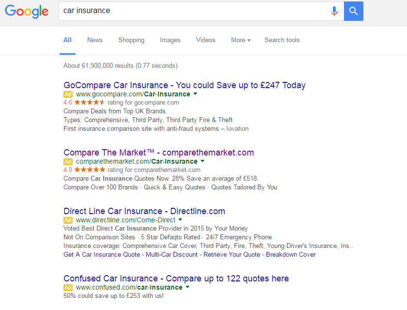
We’ll not comment on the Ads themselves here, but clearly there is opportunity for improvement too.
Gocompare.com
First impressions: On this landing page are that it’s immediately clear who the brand is and the imagery makes it clear we’re on the car insurance page. The main ‘get a quote’ CTA stands out, but there are a large amount of alternative navigational options to choose from.
Our score – 5 out of 10
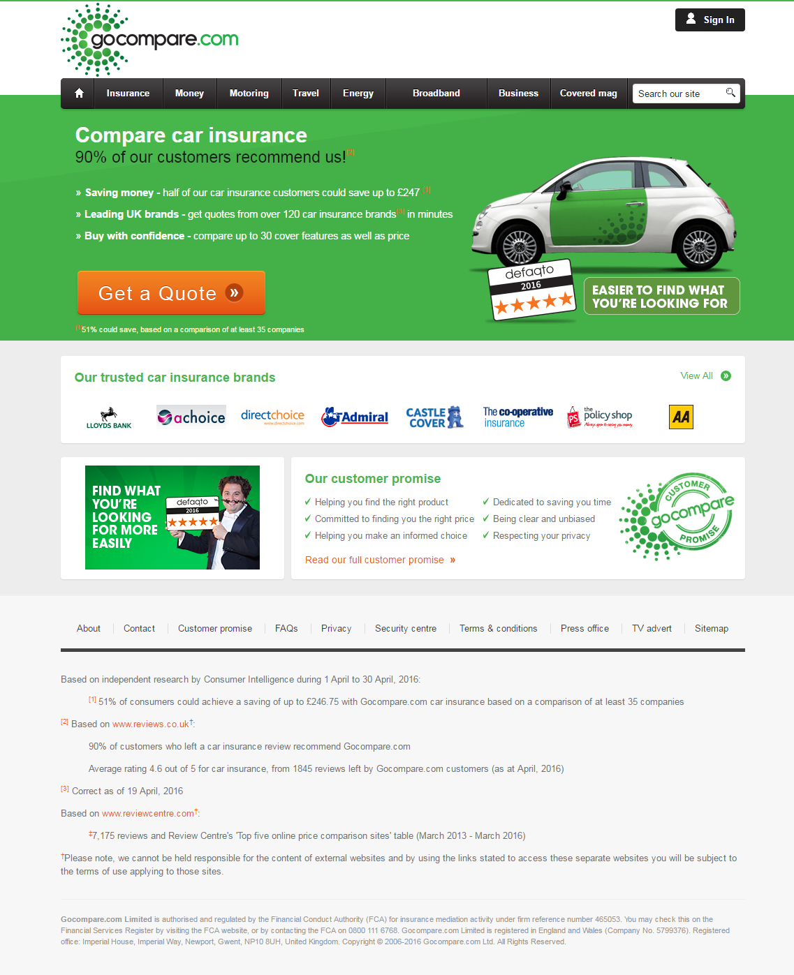
Strengths:
SIMPLICITY – It’s clear that you are expected to ‘get a quote’. There is room to improve this further by testing removing much of the main navigation to keep alternative options limited further still.
USPs – In an incredibly competitive market it is difficult to differentiate yourself. GoCompare have at least made an effort to do so with the 3 main bullet points stressing ‘money saving’ and ‘confidence’.
CLUTTER – The page is short and sweet. So much so that there is potential to add more compelling content to the page!
Weaknesses:
RELEVANCE – The PPC Ad Copy shouts loud and clear about “Saving up to £247 today”. The landing page headline should repeat this rather than this being hidden in a sub-heading.
REASSURANCE – Instead of “90% of our customers recommend us” it would be far more impactful to prominently display the logo of the 3rd party review provider (in this case Reviews.co.uk) along with the rating (4.57 out of 5 from 3,748 reviews).
DEADLINE – There is nothing compelling me to get a quote now. A time limited offer is a clear way to cover this, but if not possible then by shouting about the hundreds of other people getting quotes right now, you can encourage a visitor to ‘follow the crowd’.
Comparethemarket.com
First impressions: This landing page is focussed on reiterating the above the line brand activity rather than being a truly effective converting page. There is hardly any reference to car insurance itself let alone compelling USPs about the product – one of the key messages at the top of the page is that Batman vs Superman is now in cinemas!
Our score – 4 out of 10
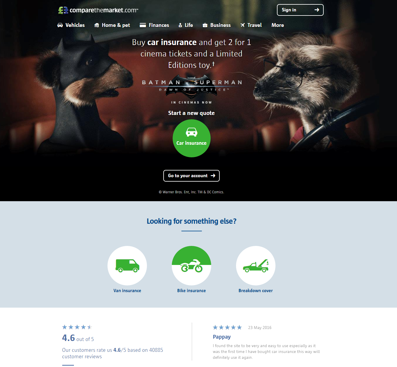
Strengths:
CLUTTER – The page very well laid out. It’s just a shame the content within isn’t more effective.
Weaknesses:
SIMPLICITY – It sticks to one message and pushes traffic to get a quote. However, the main CTA button at the top of the page doesn’t look like a button and will undoubtedly make people hesitate and think.
USPs – Apart from cinema tickets, you have to scroll towards the bottom of the page to see any compelling content about why to choose them.
RELEVANCE – The PPC Ad Copy is very generic, but at least talks about car insurance. The landing page is more relevant for a page promoting a cinema or film.
REASSURANCE – The 4.6 out of 5 stars content merges with the background and has no reference to a 3rd party reviews provider. Reviews don’t stand out. No mention of any awards, accreditations, industry membership etc. Very poor.
DEADLINE – Nothing here (unless I’m desperate to get cheap tickets to the latest blockbuster!).
Direct Line
First impressions: Another landing page riding off the above the line campaign activity above everything else. Unless I am a fan of the TV ad it lacks any compelling content at all. The page is also incredibly long (we’ve had to chop most of it off here).
Our score – 6 out of 10 (but the page shouldn’t be so long!)
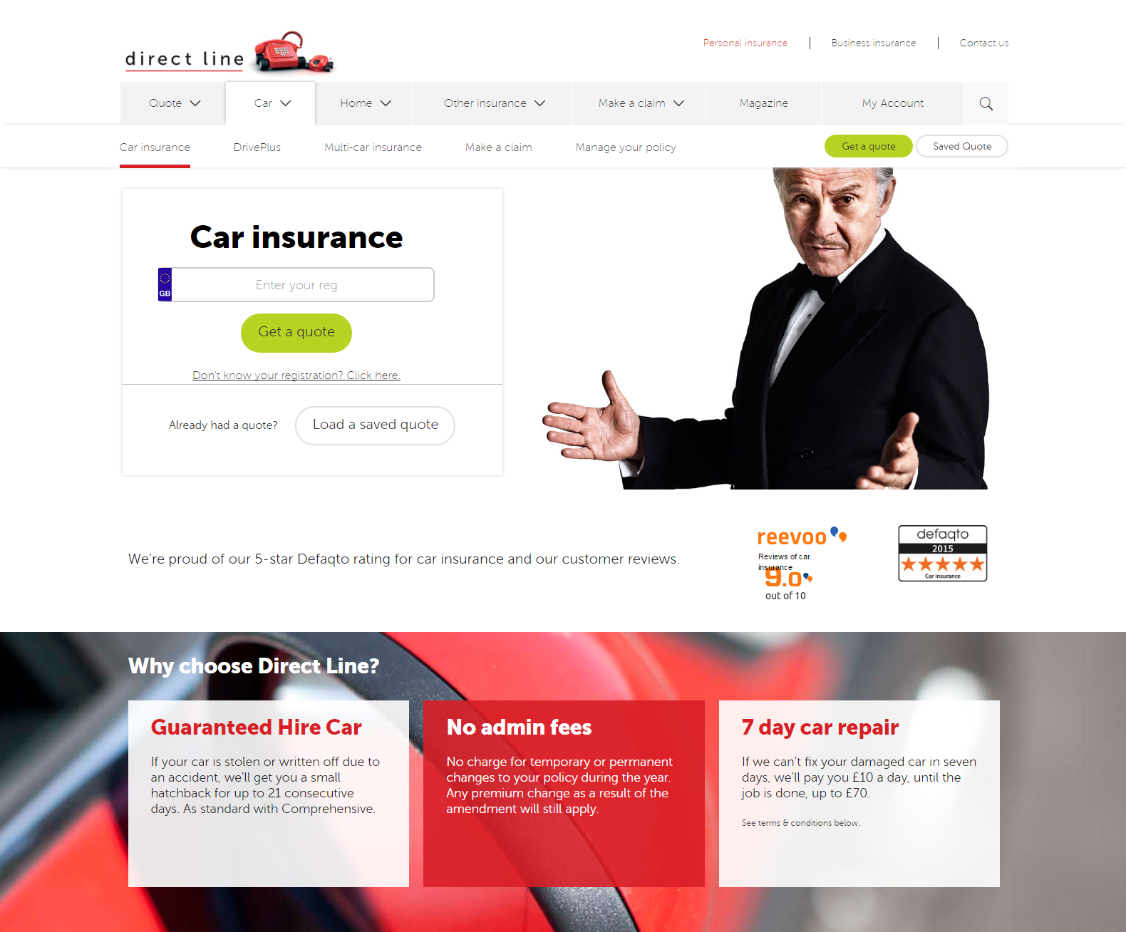
Strengths:
SIMPLICITY – It sticks to one message and pushes traffic to get a quote. This page is designed to appeal to the audience that wants 2 for 1 cinema tickets.
USPs – They actually have a ‘why choose us’ panel with some good content. Furthermore there is a long list of benefits from comprehensive cover. Excellent.
CLUTTER – It’s not possible to have clutter on a page this long.
Weaknesses:
RELEVANCE – A big picture of Harvey Keitel isn’t relevant to this journey. Also, the ad copy shouts about a 2015 award, which isn’t mentioned on the page.
REASSURANCE – There is Revoo content on the page, but most of it is hidden towards the bottom. There is very little else (awards, accreditations, industry membership etc.).
DEADLINE – Zilch.
Confused.com
First impressions: By far the most relevant headline out of this group. They have the confidence (and the profiling tools) to judge that I am male and go with a ‘men’s car insurance’ headline. Intriguing and impactful in equal measure.
Our score – 8 out of 10 (the best out of these pages by far)
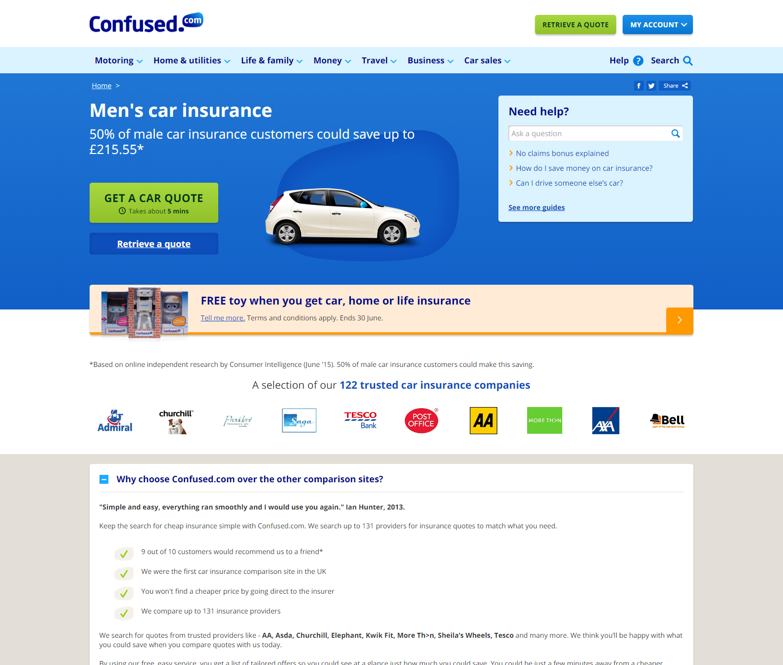
Strengths:
RELEVANCE – The page doesn’t re-iterate the PPC Ad text, but it does make an impact with the ‘personalised’ headline which identifies me as a male driver. I also love the fact that the content relating to the above the line activity (a free toy robot) is very much secondary on this landing page.
SIMPLICITY – Reasonably short page, limited to only relevant compelling content.
USPs – Plenty of USPs to compare against competitors and
DEADLINE – The supplementary CTA on the main button (‘takes about 5 mins’) is an incredibly powerful statement that lets me know what is expected of me.
Weaknesses:
CLUTTER – I’m being incredibly picky here, but I’m not a fan of the ‘need help’ panel. It distracts from the main purpose of the page. But it’s certainly worth A/B testing the impact (which I am sure they are doing).
REASSURANCE – The one thing I think the page lacks is prominent reassuring messaging from happy customers. No reviews on here from a 3rd party at all.
Conclusion
Confused.com has by far the best landing page and it is clear that they are investing time and effort into landing page optimisation. Still room for improvement for them too, but currently (according to the versions of the landing pages that we’ve been taken to) we would expect their landing pages to be performing the best from this competitor group.