When Sean Ingham joined our team for a couple of weeks on an internship, he spent some time comparing the quality of landing pages for charities asking for monthly donations. Using our landing page scorecard, which you can read more about here, he looked at the top four results of popular commercial search terms on Google:
The term we’re looking at is “Monthly donation”; if you bid to appear in the top four positions for this term then your landing page had better be up to scratch! Bids can be upwards of £50 for these terms.
This is a typical result on Google for this search:
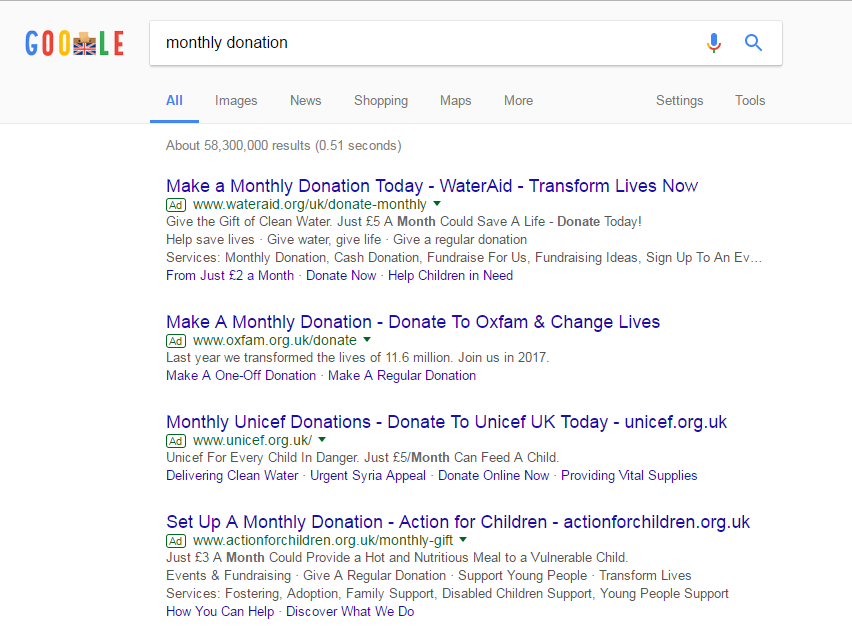
We’ll not comment on the Ads themselves here, but clearly there is opportunity for improvement too.
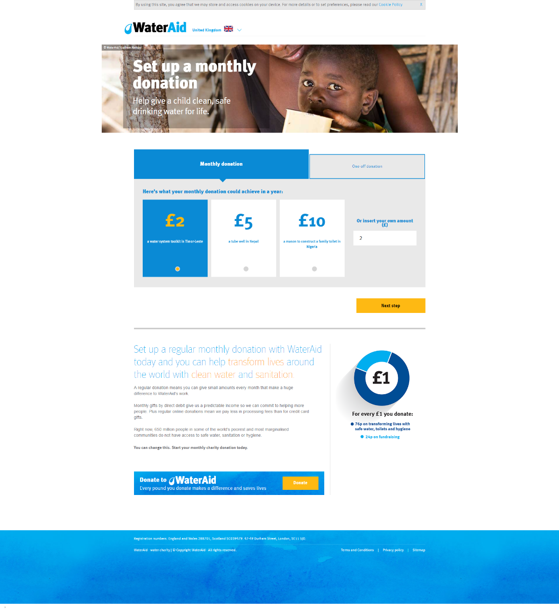
Wateraid.org
First impressions - On this landing page it’s immediately clear who the brand is and the imagery and headline make it clear we’re on the monthly donation page. The lack of navigational options makes the process simple and quick. The main ‘get a quote’ CTA stands out, but there are a large amount of alternative navigational options to choose from.
Our score – 7 out of 10.
SIMPLICITY – The language used is clear and direct with a concise message. The site also works well across devices. However, the headline below the donation section is difficult to read with the blue and yellow font on a white background.
USPs – In an incredibly competitive market it is difficult to differentiate yourself. WaterAid have made their unique charity work clear with the powerful tagline of ‘Help give a child clean, safe drinking water for life’.
CLUTTER – The main site’s navigational options have been removed from this page and you can go from google to entering your payment details in two clicks with the £2 a month option pre-selected. There are no distractions to disrupt the donation process.
RELEVANCE – This landing page is very relevant to the Google search. The PPC Ad Copy taglines match the message and imagery of the landing page. The primary CTA of choosing a donation amount makes sense as the next step to make.
REASSURANCE – The page relies on you already having an awareness of WaterAid before you arrive. As a well-known charity this is likely to apply to many visitors. However, a testimony from a donator or independent review site being linked might convince people who are sceptical.
DEADLINE – ‘You can change this. Start your monthly charity donation today.’ Is buried at the foot of the page and could be more prominent
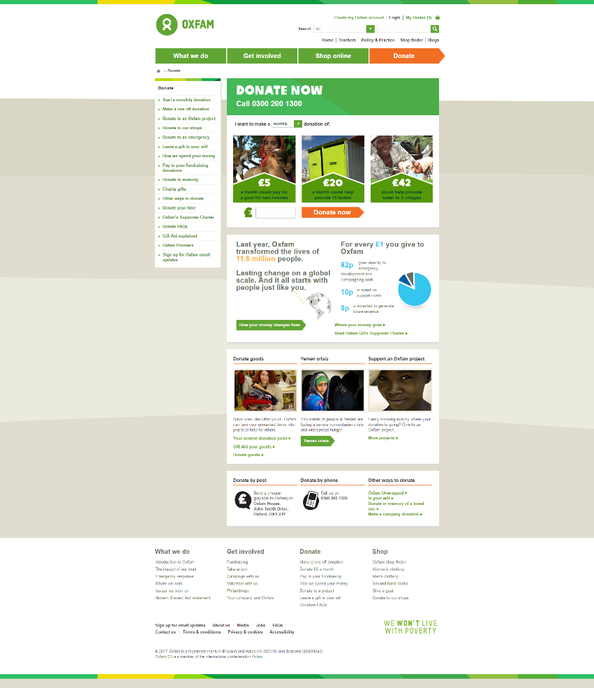
Oxfam.org.uk
First impressions: Basic landing page with small imagery and cluttered page, though it’s still easy to make a donation through the main CTA ‘Donate now’.
Our score – 5 out of 10.
CLUTTER – In comparison to WaterAid, the page is very cluttered and centred. The navigational options all over the page can be distracting too.
SIMPLICITY – Concise language with headline of ‘Donate Now’. Though the main call to action is surrounded by other buttons and could be more prominent. Mobile site simpler.
USPs – Statement of ‘Oxfam transformed the lives of 11.6 million people’ shows their size and an effective reason to choose them over competitors. The description of where the individual donations would go are also a good selling point.
RELEVANCE – The PPC Ad Copy mentions the 11.6 million people and the page headline also reflects the ad title. The pictures do represent the main message, though they are too small and less powerful than other sites.
REASSURANCE – No independent reviews to provide reassurance to donators, though they can reasonably claim to have a trusted reputation. Evidence of their work shown via awards or recognition could help.
DEADLINE – No urgency to donate in the main section. The story linked to the Yemen crisis further down the page could be more prominent to encourage urgency.
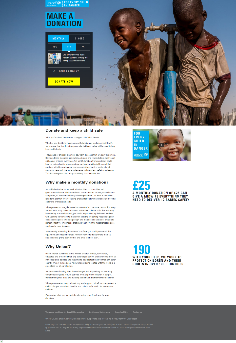
Unicef.org.uk
First impressions: Very impressive landing page with striking image of their charity work in action combined with the clear donation options. The detailed description below adds to the completeness of this page.
Our score – 9 out of 10
SIMPLICITY – One clear CTA in the first half of the page keeps the customer on message and encourages immediate donation. Succinct language used in the donation descriptions. Site also works well on other devices.
USPs – They have a good ‘Why Unicef’ section which demonstrates their compelling reasons to choose them. Their USP of helping children is made clear throughout and is very powerful.
CLUTTER – Well spaced out page with no navigational options crowding the main message. The colour of the main CTA is also not repeated which helps to make it stand out.
RELEVANCE – Relevant to the PPC Ad copy with the mention of the £5 donation and also the simple title of ‘Make A Donation’. The images and video also really help to support the main message.
REASSURANCE – No neutral third party providing reviews so again the site relies on the brand being well known and trusted. No info on the proportion of your donation that goes directly to helping, unlike the previous two.
DEADLINE – Mentions of the malnourished children and need for food and vaccinations in the text and saddening video encourage immediate donations.
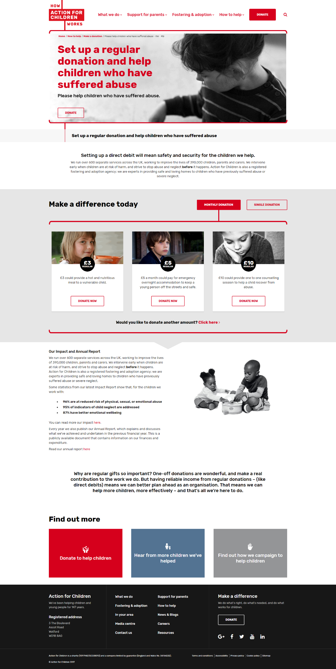
Actionforchildren.org.uk
First impressions: Detailed landing page with large text and images make a good start. After following the main CTA ‘Donate’, I thought the following page should be linked to the PPC Ad.
Our score – 7 out of 10
RELEVANCE – Ad title matches the headline and the description details can be found further down the page. Associated pictures support the main message, although no video. The primary CTA is the logical next step from this page.
SIMPLICITY – Landing page fairly text-heavy and long so as mentioned, the ‘Donate’ page would simplify the donation process.
USPs – Description of their work with children clear throughout their page, but the UK specificity could be made more obvious.
DEADLINE – No urgency to donate, could be achieved through statistics of current level of child abuse in the UK. No appeal for immediate help.
CLUTTER – Top of the page navigational options cluttering the page. The main message stands out but the primary CTA doesn’t. Again, the page following the ‘Donate’ link leads to a much clearer page.
REASSURANCE – The ‘Hear from more children we’ve helped’ page provides first-hand accounts of their work in action. Their reassuring stats such as ‘96% reduced risk’ and reports of success help to persuade users further that their donation will have an impact.
Conclusion
With a well-deserved 9/10 rating, the Unicef landing page is the strongest when measured up against our scorecard criteria. The open design and large, high-quality images leave the longest lasting impression. And the donation process was very simple from this page, whilst managing to convey the right amount of information.