Website analytics tools, such as Google Analytics, allow us to collect and report on an increasing amount of data in a faster, more user friendly and often automated way.
However, we mustn’t make the mistake of letting the tools do our job for us. Unless we examine the resulting data intelligently, the development of tools is simply enabling a faster and easier way of producing reports that mean nothing.
As Avinash Kaushik would say:
“All data in aggregation is crap”
And as the analytics tools get faster, easier and more automated, the risk of them spitting out more crap is huge!
Instead, we need to ensure we use the tools to extract insight (and wisdom) from the data. Using Avinash as a reference, the cartoon below helps illustrate the important difference between data and insight:
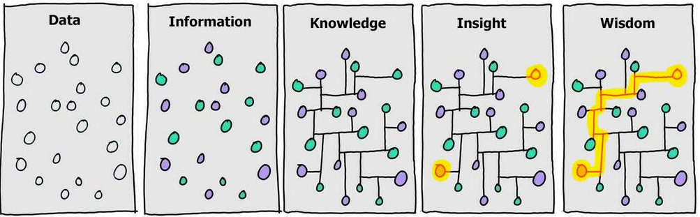
Source: https://www.kaushik.net/avinash
But it’s easier to say than it is to do. So, to try and help, we’ve pulled together our top tips to help you move towards enlightenment from the left hand side of the cartoon (data) towards the right hand side (insight/wisdom).
#1 Know what metrics matter to your business
KPIs are so-called because they are supposed to be key. If you’re looking for insight worth sharing with your wider team, you need to know what those people need to hear about.
If your team don’t already know, lock everyone in a room and force them to agree what the business should be focussing on - a process more formally referred to as a “KPI workshop”.
A quick way to consider whether a metric truly matters is:
“Would your business pay more money to improve it?”
The answer is likely an easy “yes” to sales/revenue/enquiries because these metrics surely line up with the objectives of the business. Make these metrics the focus of your hunt for insight.
On the flipside, it’s usually be easy to say “no” to session duration/bounce rate/sessions per user. These metrics are incredibly valuable for context and help you to understand the story behind the changes to the true KPIs. But they shouldn’t be the focus of your objective to uncover insight, so don’t get distracted by the vanity of them.
#2 Ask a business question before you even log in
It’s tempting to just start looking at all the analytics reports available and see what you can find. This approach might work in some cases, but if you take time to consider what you’re looking for before you start looking for it, then you’re more likely to uncover something worth telling other stakeholders about.
The sort of question we mean is:
How has our mobile conversion rate changed since our new website went live?
Is there a time of day/week when the website drives sales more efficiently?
Are visitors who watch a video more likely to convert?
Do some blogs/articles help convert visitors more than others?
Ask the question first, then log in and dig into the data to find the answer.
#3 Compare trends over time
It may sound simple, but this is an essential part of giving your reports context and helping to tell the story behind the numbers.
Is the metric you’re looking at going up or down over time? How does it compare to yesterday? Last week? Last month? Last year? Can you identify any seasonal trends?
Consider the difference between these two statements…..
“Our conversion rate in January was 10%...”
and...
“Our conversion rate in January was 10%, which compares to 8% in December and 5% last January”
This isn’t the most insightful piece of analysis, but at least it’s starting to paint a picture of what’s happening with website performance in context.
#4 Chop the data into segments
If you simply look at overall data trends, you’re going to struggle to extract any interesting insight or understand what’s really happening on your website.
By segmenting your data, and then comparing the performance of those segments against one another, you’ll find it far easier to extract trends worth sharing.
Take the example below, where the top-level data demonstrates that the overall ecommerce conversion rate had fallen by 5.92%. However, when we cut this up into device segments we can see that conversion rate for each of the three device categories has actually increased.
The real story here is that the share of traffic is shifting to mobile where the conversion rate is significantly lower. The Client is doing a good job of improving combined conversion rates over time, but needs to focus more on improving mobile performance. That is where the real opportunity lies.

In Google Analytics you can start with the simple segments built into the tool as standard; demographics, location, new vs. returning, source/medium, browser, etc… Then, you can move on to building your own segments (using custom segments) when you’re ready.
If you’re asking a good business question, you’ll probably need to use custom segments. For instance, one of our example questions was “Are visitors who watch a video more likely to convert?”.
The easiest way to analyse this would be to build a segment of visitors who watch a video versus a segment of those who don’t, then compare their behaviour.
#5 Think about your landing pages (and arriving visitors)
It’s easy to forget about the website itself and get lost in the analytics data. One way to help stop navel gazing and bring you back to reality is to look at the performance of your landing pages.
We find that by doing this, you automatically start to think more about your visitors and less about pure numbers.
When looking at your landing page performance, think about:
Visitor source - where has the visitor arrived from?
Visitor intent - what was their intention before they landed on your website?
Immediate impressions - what metrics tell me about their initial reaction?
Look at the pages - don’t just look at the numbers, look at the landing pages themselves too. Only then will you understand the numbers properly.
And then, as with all analytics data, keep an eye on it over time. You’ll start to notice some interesting trends in the type of landing pages that generate most visitors and their effectiveness.
#6 Examine the core user journey
Once you’ve given consideration to where your visitors have come from and where they’re landing, it’s logical to then consider their onward journey.
There are lots of ways you can do this, for example in Google Analytics you can use:
Behavior flow reports (seen below) that give you an illustration of overall flow of traffic
Content drilldown reports that more closely align with your website structure.
When looking at page reports you can also tab to the navigation summary to see what pages visitors went to next
Or you could even set up some custom reports to examine how specific visitors behave if they’ve seen a particular page
Whatever you choose to do, we have one piece of advice to help keep things simple…
“Don’t expect to understand what all visitors are doing on your website.”
Focus on the core user journey and on gaining as much understanding of what’s happening at each step of that journey. Then start to ask yourself why those things might be happening.
It’s at this point that you might need to start coming back out of the data again, taking a look at the website itself and considering some qualitative analysis to supplement your number crunching.

#7 Think about what’s caused a change
Remember that no matter what initial insight you uncover in your analytics data…
“Correlation doesn’t necessarily mean causation”.
Essentially, what this means is that even if you uncover what appears to be a relationship between data, one may not be causing the other to happen.
For example, you might identify that visitors who watch a video have double the conversion rate as those who don’t watch a video. This might mean that by producing more videos we can increase our conversion rate (if so, this would be causation).
However, it might also mean that visitors who intend to buy a product are simply more likely to watch a video before they buy. In which case, producing more videos won’t help your conversion rate at all (and if not, this would just be correlation).
Always keep this in mind and make sure you highlight this to the stakeholders you’re reporting insights to; ideally you’ll go even further and suggest doing some a/b testing or regression analysis to investigate further.
In the example above, you could run an a/b test to see whether a version of the product page with a video performs better than one without. A properly constructed test would allow you to examine whether one is truly causing the other.
#8 So what?!
Finally, before sharing your insight with others, for each thing you’ve uncovered ask yourself “so what”? This will help you to evaluate if what you’ve uncovered is valuable enough to be shared
Furthermore it will help you to think about what actions you and your team can take as a result of the insight you’ve uncovered. After all, the reason for uncovering the insight in the first place is so you can do something useful with it!
The 8 tips above only touch the surface of what’s possible with most analytics tools, but they should act as a good starting point for helping report with insight.
If you’d like more help with analytics, subscribe to our newsletter, come along to a SearchStar event or, better still, sign up for some analytics training with us.