Black Friday is nearly upon us - though it feels like it’s been here for weeks - and how your mobile site performs will play a big part in your online sales success on one of the biggest shopping days of the year.
The explosion of the smartphone market in the last decade has meant the share of mobile traffic worldwide has grown from 0.7% in 2009 to 52.2% in 2018. But more importantly, mobile ecommerce is growing and will continue to do so, reaching a 63.5% share of worldwide ecommerce by 2018 and 72.9% by 2021.
Clearly, the trust issues we had with the mobile experience a decade ago are over - most of us are more than happy to convert from our smartphones. And that means we, as marketers, should be doing everything in our power to optimise mobile ecommerce.
Why, then, are there so many poor mobile experiences still easily found? To help you get to grips with what makes a positive mobile experience, we’ve gathered together our top 7 tips for optimising mobile ecommerce.
1. Optimise for Speed
Mobile suffers the same problems as desktop - there is nothing worse than a web page which takes a considerable time to load. People are not patient especially when they navigate online.
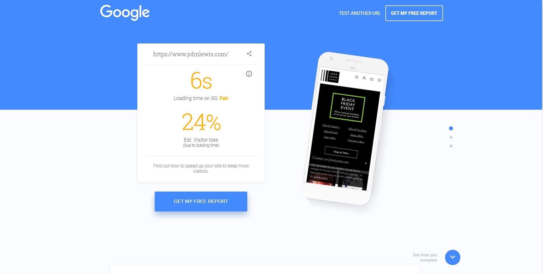
Google has reported that 53% of mobile site visitors leave a page that takes longer than 3 seconds to load. It is, therefore, essential that the load time of your website is optimised on mobile. You can start with simple changes to make this happen:
Shortening pages
Optimising JavaScript
Loading above-the-fold content before below-the-fold content (lazy loading)
Reducing the file size of images and media
Google has developed a free useful tool - Test My Site - which will give you an idea about the mobile speed of your website.
2. Test Different Devices
Smartphones come in all different shapes, sizes and have different operating systems. Keep in mind that an iPhone 8 is very different from a Samsung Galaxy S9 or Huawei P20. And don’t forget that different users will use different browsers - Chrome, Safari, Firefox and even phone-specific browsers.
The layout for your mobile ecommerce site should be adapted and regularly tested across as many different combinations of device, browser and operating system as possible. Doing so will minimise the risk of serving a potential customer a poor mobile experience.
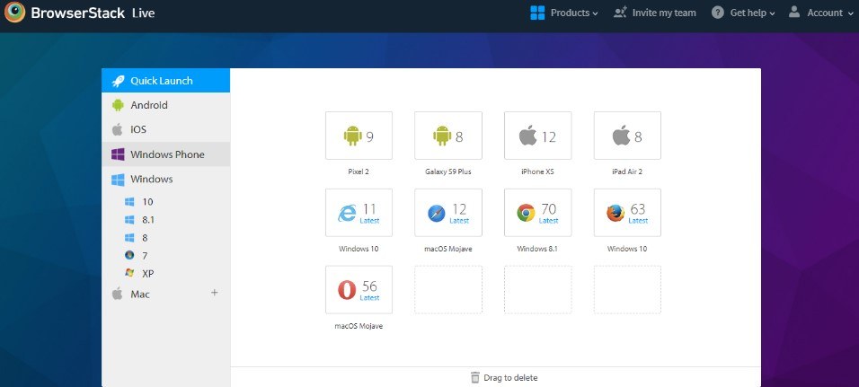
If you don’t have the resources to invest in a physical testing suite, consider tools such as BrowserStack, which is a very useful for cross device testing.
3. Consider Screen Size
Essential in all this is that customer behaviour is very different on mobile. The most obvious difference is that the screen of your mobile is significantly smaller than that of your desktop. This presents developers with a challenge - how do you achieve the same impact on mobile?
The first port of call is to consider your call to actions - these must be prominent and easily interacted with. For example, a sticky CTA works really well on a mobile screen because it follows visitors on the page as they scroll.
4. Let Your Content Sing
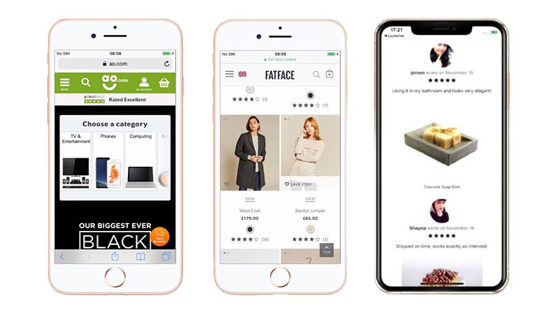
It isn’t sufficient to simply remove content or reduce its size just because you’re working with a smaller screen. Content - images and copy - still have to be relevant, easy to digest and impactful.
Indeed, creating a good first impression on a mobile device can often influence cross device conversions – users are more likely to come back if they’ve had a previously good experience.
Think carefully about navigation and how you display your content. Ultimately, users are lazy and while scrolling is becoming more acceptable, having to zoom in or navigate through lots of pages to find information is a no-no. They will have moved on to a competitor before you know it.
5. Don’t Ignore The Thumb
Touchscreens are sensitive and it is important to keep the navigation straightforward. The menu must be easily accessible and make sure buttons, fields and links are well spaced and big enough for big fingers and thumbs to click. Don’t frustrate yours users unnecessarily.
6. Make Forms Simple
Filling in forms is one of the most frustrating things to do on a mobile device. Ensure your forms are easy and quick to complete - users should be able to enter information and see what they are doing.
You can take this further by adding in relevant formatting for mobile; dropdowns, toggles, calendar functions, and numeric keyboards. Another trend is to include a “find my address” option with a postcode lookup.
Finally, think about automatically saving user data in case of error. Remember that users are impatient and they probably won’t take the time to fill in the form again.
7. Encourage Trust
It’s incredibly important that your customers trust you - reassurance is as, if not more, important on mobile as it is on desktop. The easiest way to reassure your customer base it to make sure customer reviews are clearly visible throughout the experience.
Beyond that, it’s a good idea communicate that customer data is handled well and safely - this can be achieved with clearly labelling.
Conclusion
With mobile set to take almost three-quarters of worldwide ecommerce by 2021, how your company presents itself in handheld format is becoming more and more important. In fact, it’s arguable that the mobile experience your website offers is far more important than the desktop experience.
Hopefully the above tips will help you ensure that your website’s mobile experience is up to scratch, get one step ahead of the competition and generate more of that lovely ROI we’re all in search of.